Monday 13 April 2015

Web Coding Protocols

WEB CODING PROTOCOLS
 
WEB PAGE
 
When creating a web page the construction of the web page and design of the web page is of vital importance. Creating an interesting web page is essential to creating a successful web page. The text of a webpage needs to be easy to read, so nothing too fancy, but at the same time needs to be a plain font but interesting, most webpages rely on simple fonts such as Arial or Times New Roman.
 
The colour scheme also requires thought when creating a webpage, using colours that can get positive connotations are the better choice for positive websites appealing to children or younger people, neutral colours such as blue can be used for information websites whereas darker or colours with more negative connotations according to colour theory could be used for websites aimed at teenagers such as music websites, however, it would be biased to state that negative colours are seen throughout teenage oriented websites as they can feature both light and dark colours. Darker colours are primarily viewed within certain genres of music so colour theory for websites is difficult to decide upon.
 
Tables on websites aren't essential but can help to layout the webpage better when listing information whilst on the webpage rather than leaving it cluttered around the page. The page itself is normally made up of tables just to help get the information across better.
 
Hyperlinks are good for webpages as they allow people to get around the page quickly and easily rather than having to constantly search for what they want on the webpage, they can also be used to link to useful websites or to social media sites that may be getting used by the webpage.
 
Depending on the page in question, the language and terminology used may differ, on a more child based webpage the language will be simple to understand whereas on webpages discussing a work or university the language may be more complex and feature terminology which references the webpage/site that you are on.
 
Metadata on a website helps to emphasise other data which may already be previously known, using metadata on a webpage will help people understand what is on the webpage better. Text documents metadata is useful in helping people to understand data such as who the author is, the length of the document and when the document was written. Image metadata includes image size, colour and image resolution.
 
HTML
 
HTML or Hyper Text Mark-up Language is the most commonly used mark-up for creating webpages and websites. The layout, colour, text, images and everything else which is on a website is marked by html. HTML has a more complex version which is known as Extensible Hyper Text Mark-up Language. The reason for the more complex version for HTML is due to technology advancing further and further, such as mobile phones and tablets, having XHTML allows for these devices to process properly when visiting websites. XHTML tags are much more difficult to understand than HTML tags due to the complexity of technology advancements and the changes that have to be gone through to get to mobile technology. HTML is currently made up in the following format <HTML><HEAD>(Within these brackets is what the document is about)<BODY> and it then ends with </BODY></HTML>. Any information that is required goes between the two 'BODY' sections of the mark-up, this is normally the main body of the website.
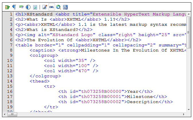
An example of XHTML being used.
 
 
CASCADING STYLE SHEETS
 
CSS are used to help with the style of the webpage, using cascading style sheets makes the whole process of editing the styles a lot easier than were they not used. Using them allows you to change as much as you want at once rather than changing individual styles which can be time-consuming and inefficient for whoever it is that is changing the style sheets. They are often used on webpages that feature HTML or XHTML. You use something called an embedded style sheet which is placed at the head of your webpage and then another external file is attached to help you choose the style that you want.
 
TERMINOLOGY
 
Authoring is used to help create and programme the website and is done by using software's that allow for this to happen, it isn't just website based and can be used for DVDs, CDs, etc.
 
Websites are the primary focus of the internet and are used to showcase information relating to the specific subject that more information is required on. There are millions of available websites which have information on anything that you could want, websites can showcase other websites and are used for both informative and entertainment purposes.
 
Uploading basically means to upload something onto a website or webpage which is then seen by others. Photos and videos are uploaded regularly on websites such as twitter and Facebook, uploading files onto websites also applies to this.
 
File transfer protocols (FTP) are standard protocols which are used when transferring data from on webpage to another. It is used to send files with the internet, OneDrive is an example of FTP as it allows for your files to be transferred to the internet, Twitter is also an example when photos are uploaded, this is done using FTP.


Interactive Media Authoring

INTERACTIVE MEDIA AUTHORING
 
AUTHORING
Authoring a website means to write the websites electronic/digital documents. Adobe Dreamweaver is one of the most commonly used web authoring tool types which is used to create these documents.
 
 To plan a website for interactive authoring would require consideration of various different parts of the website, the main planning would have to go into the graphics such as images or videos which would appear on the screen. The layout would also need to be planned out by the website creator. The website planner would also require people to help create the website so this would require planning as well, for example the number of people working and the payment.
 
The design of the website has to, of course, look as professional as possible so coming up the layout of the page is an important part of the design planning aspect of authoring.
 
To develop a web page would need a large and vast knowledge of different programme types such as C++ or Actionscript, these would be different depending on the software used to create the webpage or website.
An example of C++.
 
The production of the webpage would have to be a highly co-operative effort between the programmers and the webpage designers, the reason for this is that it would help to create a website that is easy to understand and find your way around when searching the actual created website.
 
APPLICATIONS
 
The following indicates the different applications of interactive web authoring: entertainment, marketing, presentations, product catalogues, documentation, games, education, computer-based training and assessment. Despite the fact that Adobe Dreamweaver and other web authoring devices can help to put all these into a website, other software can be used to create the applications for the website, such as Adobe Flash for website animation purposes, or Adobe Photoshop for digital graphics purposes.
 
The use of interactive web authoring for each of the different mentioned applications allows the creators of video games for example, to show off their idea in a cheap simple way on a website that has been created.
 
FORMAT
 
Web formats differ from CD/DVD formats due to the differing ways that the companies may want to get the message across of what they are creating. For example a video game webpage advert may allow for a simple click to go to the main webpage, whereas some webpages may have interactive adverts allowing you to click preferences of a differing products, this may be more interesting of an idea to use and draw people in on the website.
 
Presentations are sometimes implemented for the audience to interact with on webpages, these use various animation techniques within web authoring and can be used for information or instruction purposes.
 
Handheld devices such as phones require touchscreen capabilities on web pages which work the same as mouse clicks, however the web authoring may be different and require different programming to work.
 
ASSETS
 
Different assets are available to use for the creation of webpages using a web authoring tool. Examples of these include: sound; text; video; vector graphics; animations and images. These can be used in different ways during web authoring to make the webpage look a lot better, using animations can give the creator freedom for the website to look and move however they want, videos and sounds can be used to similar effect for he websites' creation.
 
INTERACTIVITY AND CONTROL
 
Using assets such as the ones mentioned allows for interactivity within the webpage as do putting in interactive buttons on the website, these are also created using web authoring. Creating interactive sections like this requires scripting something which can be accomplished in various web authoring programmes. These can be used on buttons or hotspots to send people to different sections of the website. Effects and slideshows can be created for interactive purposes on webpages using web authoring and can be created on various programmes that are available to use for web authoring, using effects and slideshows helps to draw people in to interact with the website.
 
LIMITATIONS
 
File sizes are a problem during web authoring, creating animations or videos within Adobe Flash can result in really large file sizes which may be difficult to place onto a webpage. The large file sizes can result in long and slow download sizes when placing the asset onto the webpage. The content type can also be an issue and a limitation as the content may not be approved by the content creator or certain interactive adverts may be aimed at a specific audience and be seen by people who aren't the age range chosen for the product. A plug-in is another limitation especially if the software is outdated making both the software required and the plug-in defunct and difficult to get hold of meaning a loss of work and creation.


Friday 23 January 2015

Portfolio Production

I started out designing my portfolio on Adobe Photoshop CS5. I created a new document by pressing file then new. I changed the document to A3 size and made it landscape with a width of 420mm, or 42cm and a height of 297mm or 29.7cm. The colour mode of choice which I went for was CMYK with 8bpp, although RGB also works just as good when creating your portfolio. The resolution choice that I went for was 300dpi, (dots per inch) as this is helpful in getting better quality images for printing as the resolution is far higher and far better than a lower dpi number. The image below showcases everything I have mentioned during the creation of the new A3 file.
 
 
 After I completed all of the file creation, I begun work on my front cover which I decided to keep simple. I found a font on a website called Dafont.com which I then downloaded and put onto Photoshop. I chose the font known as Autumn Whispers. The reason I chose this font is that  had decided early on to stick with the colours, red, yellow, orange and brown which are all associated with the season Autumn. I wrote out my name at the top of the work and then wrote 'portfolio' below to indicate what it is I am creating. I made sure they were accurately placed and then I added a black stroke outline around the outside of my page. After this was completed I added arrows to some of the letters in my name facing to the right to indicate going forward.


I decided afterwards to keep with a positive theme on the cover and created circles which gradually got smaller across a diagonal on the page. Due to the effects that I added to each of them the circles looked much more spherical and 3-Dimensional which made my front cover look much more appealing than if they had just been stuck on the page with no effects or changes. I coloured the circles orange due to the Autumn theme I had decided to go with and included a red effect to help with the 3-Dimensionality of my work. The effect I chose was called inner shadow.


I then once again decided to place arrows onto my work and created arrows that all pointed in a direction of moving forwards to keep positivity and placed them onto the circles. I once again added an after effect known as outer glow which made the dark arrows stand out and have a slight 3-D look to them.
To finish off my work I included a orange background which faded to white on the left hand side of the page. This was accomplished by going onto the paint bucket tool and choosing the gradient tool rather than the paint bucket tool itself. I chose the shade that I felt looked appropriate for my work and included it, the image below showcases my final front cover idea for my portfolio.


After I had completed my front cover I had to complete all of the actual portfolio pages which required me to keep a consistent background theme throughout my work. I decided to make the portfolio page backgrounds interesting but not bright so as to distract from the actual work that I am showing during interviews. To start off the template for my portfolio pages,  added a line going across the top and a stroke around the outside, the line was used as a guideline for when I titled each separate portfolio page.
 
 
I then included two boxes which were created to place my writing and work in. In the left box  included 'Image of Work' and in the right box 'Writing about work'. These were written to give me an indication of what went in which box.
 
 
On the background I decided to stick with the elliptical circle theme which I had used on my front cover, however I decided on a more elaborate look than on the cover. I started off by including grey circles with a maroon inner shadow which helped to create the 3-Dimensionality which is what I tried to do on the front cover.
 
 
I then added in a few larger and brighter circles which I once again gave an effect to make them look more than just flat circles on my work. I varied the colours of my circles but stuck with the intended Autumn colour theme. I also kept on changing the size of the circles to give the background a more interesting and spontaneous look.


I included several different red, orange, yellow and brown colour variations to add to the effect and make my background more interesting to look at but not so much that it distracted from the main point which is the work that is on each of the different pages.
 
I once again used the gradient tool but decided to go with a light brown colour to make the quite bright background a little less over-the-top and help to give more attention to the work. To finish off I changed the opacity on each of the elliptical circle layers to 40% to create a more shadowy look and a look that wasn't as bright and outlandish.


APPLICATIONS OF INTERACTIVE MEDIA GRAPHICS

APPLICATIONS OF INTERACTIVE MEDIA GRAPHICS
 
In applications of Interactive Media Graphics there are various different methods of navigation. Rollover buttons are useful for movement from the home web page to any of the articles that are included within the website.
 
 
On web pages there are links known as navigation bars which are useful for navigating the website that they are on. They normally have a primary and secondary bar for navigation purposes but can sometimes have more depending on the technical nature of the website.
 
A navigation menu is similar to a navigation bar, however it is a long list of buttons that showcase ways to get to different parts of a website. A navigation menu is usually listed at the side of the web page making it easily accessible and easy to navigate around the web page.
 
Animated graphics can mean a range of things including flash animations to advertising banners. An animated graphic is a picture that has more than one image per second which helps to depict movement.
 
Animated GIFs are animations that appear on a web page and depict many different things such as something based on the website that you are on. GIF is an abbreviation of Graphics Interchange Format. They normally carry on and on without stopping but occasionally will stop after showcasing the animation a couple of times.
Web banners are usually rectangular graphics that advertise either above, below or at the side of the article. Web banners are used to entice people to other websites with the advertisements that they showcase.
Logo graphics are logos that are designed with an image style on them to give them a more graphical look than just writing. Graphical logos may be preferred as they look better and people remember them more.
Screen icons are small images that represent programme files on a computer screen. They are usually small which helps them to be grouped easier and allow for more icons to appear on the screen. They can also appear on other devices such as mobile screens as seen in the image below.

 
http://cyberbuzz.com/wp-content/uploads/2013/09/iphone-home-screen.jpg

Backgrounds in digital graphics are normally bright and really stand out in comparison to the foreground. They are attention grabbing and helped to create a scene for the information to appear on which is normally based on the information within the foreground.
Texture graphics help to give the thing designed a more realistic look to it and add a lot more detail into the work that has been created. They are used more on 3-D graphics to help them look more interesting after they have been created.


Thursday 22 January 2015

IMAGE CAPTURE

IMAGE CAPTURE


An image capture is a device which is used for taking images and storing them in a safe place. It is a digital image, so can be transported to and from different digital devices, such as a digital camera to a computer without losing the image or the quality.

Scanners are useful for getting images onto a computer or storage device that are A4 in size. These images can be anything such as drawings or book extracts and can be placed onto devices such as mobiles or computers. The images can then be altered digitally to the preference of the person who scanned the image in.

A digital camera has three different forms of image capture known as single-shot, multi-shot and scanning. Single-shot images are images that are either made up of the three primary additive colours, red, blue and green, or a Bayer filter sensor. Multi-shot images are shots that are exposed in three or more of the apertures openings, this helps to capture the image and help create an image that looks good. Scanning on a digital camera helps to gain a very high-quality shot as it scans for the three colours and puts them onto three lines which is called a tri-linear shot.

http://harrisoncameras.s3.amazonaws.com/p/l/VBA360K001.jpg


The cameras resolution also plays a part in the image capture as the resolution is made up of pixels per inch, these pixels help to maintain quality and detail depending on how many pixels there are per inch. The images that are captured will change in quality depending on the screen size meaning that images that are taken may look different on a computer screen than they do on the digital camera.

Storage for images can include various places. One of the most used digital storage formats is a memory card, this helps to preserve the images that have been taken and allows them to be taken to different places and put on other digital devices. File sizes showcase the sizes of the images that have been taken. Depending on the detail of the images, the file size may be large or small, if the file size is smaller, more images can be taken and kept, therefore having larger images will mean that less can be taken.


http://upload.wikimedia.org/wikipedia/commons/0/0b/Memory-card-comparison.jpg


VECTOR IMAGES

VECTOR IMAGES
 
 
The term vector graphics means an image that is made up of mathematical based expressions, for example, curves, points and lines. They are also based on shapes and polygons. The images are made up of lines going through certain 'control points' or 'nodes'. Theses points go through the x and y axes and help to visually show the direction of the lines. Each of the separate paths can be changed differently in the thickness, the colour and the fill. Vector graphics are also different in that they aren't made up of pixels. Because of this, magnifying the image gives it a much clearer and crisper look than a pixelated image once it is zoomed in.
 
The vector images, like raster images, have their very own set of file extensions.
 
EPS: Encapsulated PostScript
AI: Adobe Illustrator
FLA: Adobe Flash Application

Even if a vector image is large, the image file size will still be relatively small, also a vector image is easily scalable, meaning that if it is made smaller the image itself doesn't lose any of its' detailing that it has, so its' quality constantly remains the same no matter how small or large it becomes.

Below is a look at a vectorized image in comparison to a rasterized image. The raster image is clearly less high quality than the vector image. The vector image quality is fully detailed in comparison to the raster image.

 
http://api.ning.com/files/aCFMTTNs7OP3jH51v8dTDLG2lWqirUn1HWS-DcUDUTHqg3D2wr8QA5J2fAFXsdZdoUW7fbSPAsLB9y4USsXhBw__/raster_vs_vector_surveying.jpg


RASTER IMAGES

RASTER IMAGES
 
A raster image is a way of displaying/representing a digital image. It is also known as a bitmap image. The image that is created can be shown in a wide range of different and common formats such as bmp, png, gif, tiff, jpg and psd.

BMP: Bitmap
PNG: Portable Network Graphics
TIFF: Tagged Image File Format
JPG/JPEG: Joint Photographic Experts Group
PSD: Photoshop Document
GIF: Graphics Interchange Format

A raster image is normally larger than a file that is a vector image and is occasionally difficult to rework and change without losing some of the information. There are two different forms of compression known as lossy and lossless. A lossless compression allows you to compress the file and recreate the original image file exactly as it was. Lossy compressions get rid of anything that is viewed as unnecessary on the image and make the image file size smaller. Creating a lossy compression does mean that you can't get back the original file should anything go wrong with the lossy compression.

This is a zoomed in raster image showcases the individual squares that make up a rasterized image and give it a blocky effect.


http://www.printcnx.com/wp-content/uploads/raster.jpg


PIXELS

PIXEL
 
A pixel, which used to be referred to as a picture element, is the colour unit which appears on a screen such as a computer screen or on a image of a computer. The size of a pixel depends on the resolution of the screen which they are on. The resolution display on screen, if set to the maximum resolution display, the size of the pixel will be the same as or equal to that of the dot pitch size. If the resolution on your screen is anything less than the maximum that it can be, the pixel will end up being larger than the size of the screens dot.
 
A pixels colour is made up of the three different RGB colours on the colour spectrum, these colours are red, green and blue. It can also be made up of the CMYK colour mode which is cyan, magenta, Yellow and Black. Each pixel has a maximum of 3 bytes of data which helps to specify a pixels colour and is used for each of the colour components. A 24-bit colour system uses all three bytes within the colour however many only use just 1 byte which ends up limiting the screen display to only 256 colours, using these colour system helps to increase the intensity of the colour depth and means bits per pixel or bpp. The bpp can go up to 24bpp which is 16777216 colours which is known as true colour.
 
The word pixel is a mixture of pictures and elements which is where picture element originated and was eventually shortened to pixel.


Non-pixelated images look a lot better than pixelated images and helps the images to appear a lot crisper and smoother if they aren't pixelated, the reason for this is because pixelated images show the exact pixels which are involved in making up the image, whereas a non-pixelated image doesn't show the exact pixels and is therefore a much clearer and better image.

A pixel doesn't necessarily have to be squares that make up an image and can be other shapes such as dots or lines. A showcase of different pixel designs are below.


http://upload.wikimedia.org/wikipedia/commons/c/c4/ReconstructionsFromPixels.png


OPTIMISING

OPTIMISING
 
 
When something is being optimized in graphics terms, it basically means getting a good image quality balance and a good file size. The target destination when an image is optimized is the final destination that the image is going to on the computer or digital format.

The bit depth of an optimized image is how the colour of the pixels look as stated in a previous blog post. If the pixels are reduced on the optimized image, it will create a poorer looking image but will allow the target destination to be quicker, having more pixels will have a higher quality but slower load time for the image. The image below features 3 different bit depths that are available including 8, 16 and 24. The difference is visible when comparing 8 bit to 24 bit.


https://05049cmur.files.wordpress.com/2011/09/bitdepth_examples_large.jpg

The resolution of an optimized image will change the file size and image quality, although the optimized image has both of these things changed, they will not happen at the same moment. Changing the image quality to a higher quality will allow for a much better quality optimized image but will make a much larger file size. A worse image quality will make the optimized image have a smaller file size which may be preferable depending on how many images are required.

The dimensions of an optimized image is basically the size of the image in question. Changing the dimensions of an image size allows for smaller and larger images to be created depending on the needs of the image and the space available on the optimized image. The image below showcases an optimized image that has a smaller file size and an unoptimized image.


The intended image output helps the optimized image to fit onto the digital programs page that it is on such as a computer screen, phone screen or website page.


COLOUR SPACE

COLOUR SPACE
 
 
A colour space is defined as being the way the colours are set up. A grayscale colour space is basically an image that is made up of various different shades of black and white. There are also other different colour space variations.

An RGB colour space or a Red, Green and Blue colour space, is any colour that is within or based upon the RGB colour model.

 http://upload.wikimedia.org/wikipedia/commons/8/83/RGB_Cube_Show_lowgamma_cutout_b.png

The above image showcases an RGB colour cube and shows the different variations of an RGB colour space. An RGB colour space consists of the three primary additive colours which all make up the various different chrome colours, some of which can be seen on the colour cube above.

Another one of the various different colour spaces is a YUV colour space. YUV is basically the luminance and chrominance of the specific colours. YUV colour space is primarily used for TVs as it is used to helped a person see what the colours on the TV are.

HSV is another colour space which stands for Hue, Saturation and Value. HSV colour spaces are normally in image editing softwares that are available and colour pickers. They are also sometimes used in computer screens.

BIT DEPTH

BIT DEPTH


The bit depth is how many different colours are available in an images' colour palette through the use of 'bits', these bits specify each of the different colours. Although the image may not use all the colours found in these specific bits, it helps to create a specific colour if it is needed and with a high amount of accuracy.

A colour pixel is always made up of three colours which are red, blue and green. These three different colours can have various different colour values depending on how the colour is specified, another name given to the different colours is bits per channel. The bits per pixel or bpp, is representative of the total sum of the colours within the specific bits.

http://www.foothill.edu/print_arts/halftones/slides/bit_depth_chart.jpg

The colour chart above showcases the different colour amounts depending on the amount of bits. The human eye is only capable of distinguishing 10 million different colours, so having an image that is 24 or more bits is excessive.

A 16 bit image is known as a high colour image, there are 16 different colour level variations available for the 3 colours red, blue and green.

A 24 bit image is known as a true colour image, as the total amount of colours create a perfect image using all the available shade variations of red, blue and green.